Machinist Chest House
Kinetic architectural elements
transform a dated penthouse
into the ultimate space
for entertaining.
CLIENT
Private Client
YEAR
2017
PROGRAM
Residential
STATUS
Completed
When we first toured this penthouse unit with our clients, the most impressive thing was the view….the interior was dated and dark, and not functional for entertaining and hosting overnight guests. Our challenge was to work with some serious constraints and somehow find extra space in every way we could – to support a fully open space for entertaining, that meant finding dedicated storage for everything from the vacuum cleaner to a bed, from a dining table to some spare walls, and from blankets to clothes. And we did it!
The design inspiration for the house is early/mid-twentieth century machinist chests, which when closed, are clean, simple boxes with a handle for carrying, but when opened, reveal many specialized compartments to support the machinist’s work. We took it a bit further and starting thinking about other fun “reveals” – like lining in clothing, or candy hidden inside Advent calendars – and began designing those fun and practical moments into this project.
We moved the kitchen from a dark corner out to the main space, and, inspired by our clients’ directive to create a dark, moody, dramatic space, rendered the space in walnut, soapstone, brass, custom tiles, and hidden light fixtures. Perfect for entertaining, the giant island looks into the main space of the home, and the dramatic views of Boston and Cambridge. The living room area has another “dark” space, where concrete tiles, walnut shelves, and hidden storage double as additional seating area.
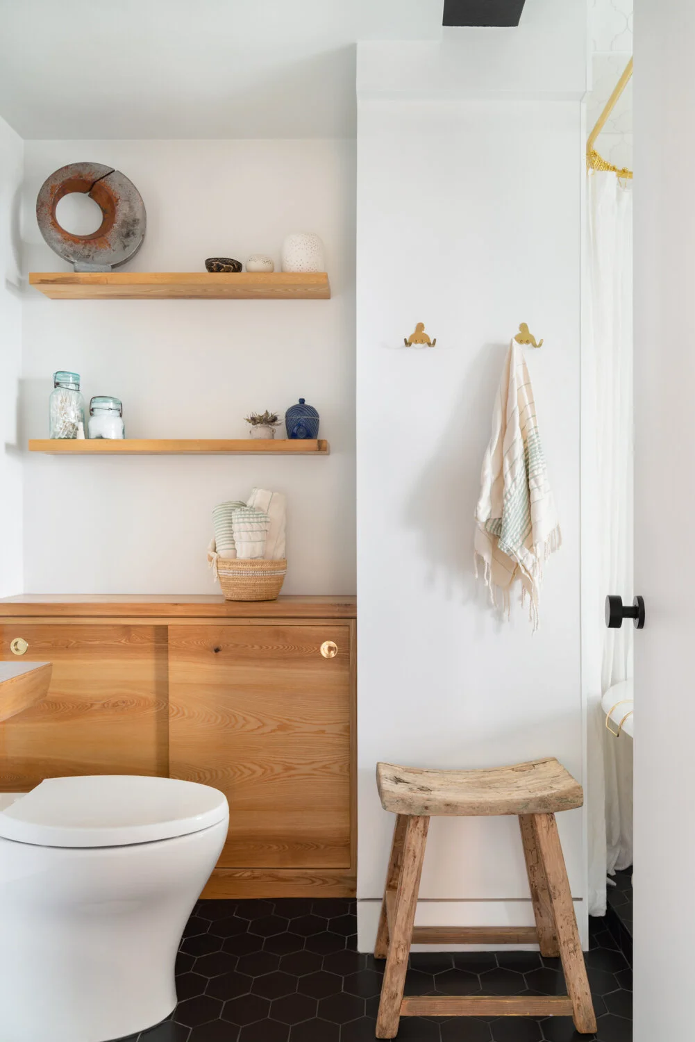
In the dining area, a wall of storage opens to reveal a murphy bed, additional leaves and chairs for the dining table, and a desk with space for a printer. When guests stay, the whole area transforms into a private sleeping area adjacent to the guest bathroom, but most of the time, it’s dining/living/working area. The guest bathroom includes a piece of switchable glass, allowing occupants to either have a clear view of the skyline while bathing, or can flip a switch for complete privacy.
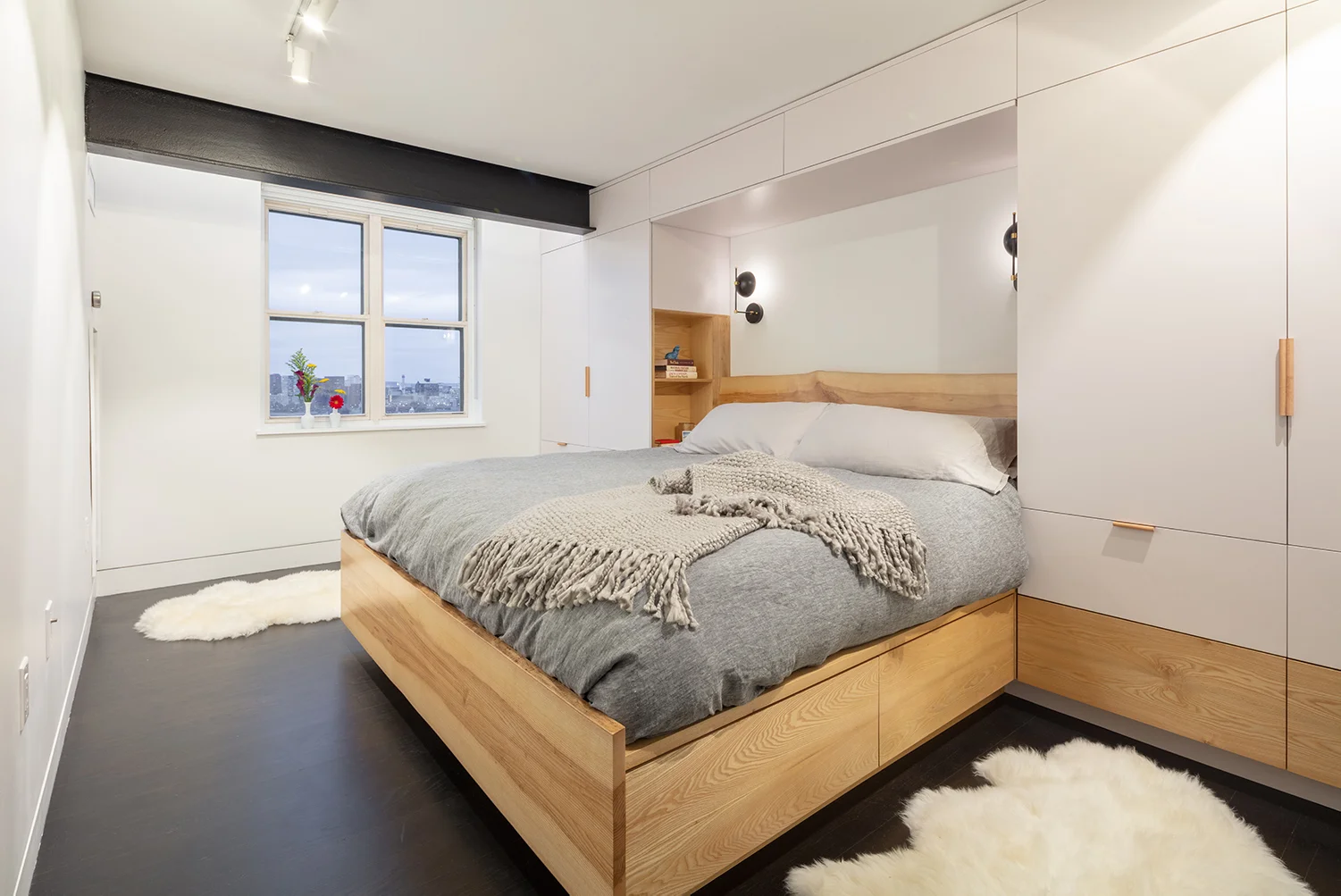
The master suite includes a custom designed and built oak bed, integrated into his-and-hers closets, complete with upper “attic” storage, and drawers under the bed. Next to the bed, built-in nooks provide a spot for a book and to charge devices.
To help create more space in the unit, we removed the drop ceiling and revealed the steel structure of the building, which we used as armature for hidden lighting. We also included a dedicated laundry room, coat closet, and pantry – imperative, especially in small, open spaces, to keep stuff out of sight.
We’re very proud of this project, and the opportunity our clients gave us to really push some interesting design solutions!
Other projects you might like:
A full interior and exterior gut of a classic Somerville 2-family.
Adding space without adding on: making a bland condo fun and useable for a growing family.
Building on an unbuildable site by optimizing an extreme vertical section.
Hyper-efficient space usage for a rapidly expanding local brewery.
Creating storage in unexpected places for a colorful home in Jamaica Plain.
Research + renovation of an 18th century Germanic limestone house.
Kinetic architectural elements transform a dated penthouse into the ultimate space for entertaining.
A deep energy retrofit for an 18th century log house.
Shifting floors and negotiating historic requirements to make a tiny old rowhouse work for a globetrotting lifestyle.
A crucial addition fixes everything!


